The Problem
LGBTQIA+ youth face heightened exposure to minority stress, discrimination, family rejection, social exclusion, across home, school, work, and public life. The digital tools meant to help introduce their own risks: outing, misused data, interfaces built on assumptions about identity that don't hold for everyone. I led the literature review, competitor analysis, persona development, design system, and final deck. Wireframing, research, prototyping, and testing were shared with my co-designer, Nhu Hua.
Research
None of the five platforms we compared, TrevorSpace, Q Chat Space, YouthLine, imi, or general social media, combine a stealth interface, configurable crisis contacts, and resources that go beyond mental health.
| Platform | Stealth UI | Crisis Config. | Diverse Resources | Data Privacy |
|---|---|---|---|---|
| TrevorSpace | None | None | None | Partial |
| YouthLine | Partial | None | None | Full |
| imi | None | None | None | Partial |
| Quiet Circle | Full | Full | Full | Full |
Limitations: small, self-selected sample (11 respondents, 2 interviews), urban skew, no race or ethnicity data collected. Worth naming plainly rather than glossing over.
Family Isn't a Safe Default
Every crisis tool we reviewed assumed a family member belongs on the contact list. Our survey said otherwise: 6 of 11 participants excluded family from their crisis contacts entirely. Building Quiet Circle's core safety feature around that number, not the industry default, is what shaped everything else.
The Solution
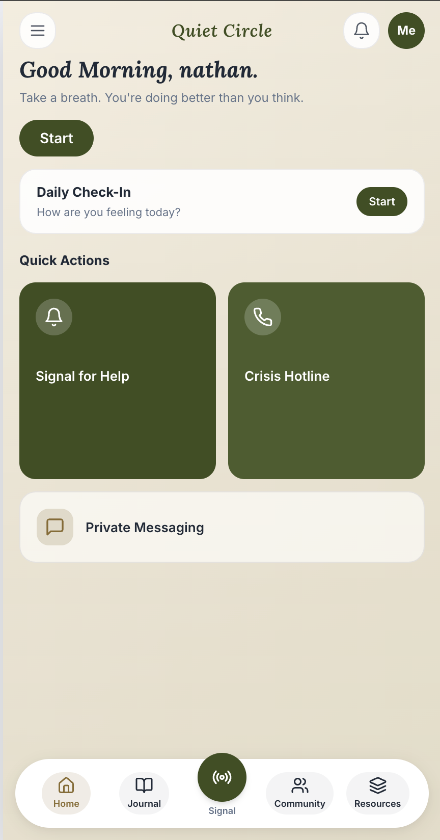
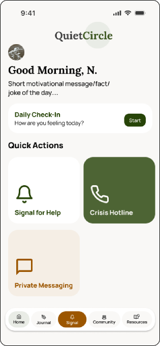
Quiet Circle combines five core features in one discreet, identity-affirming interface.
Live Signal
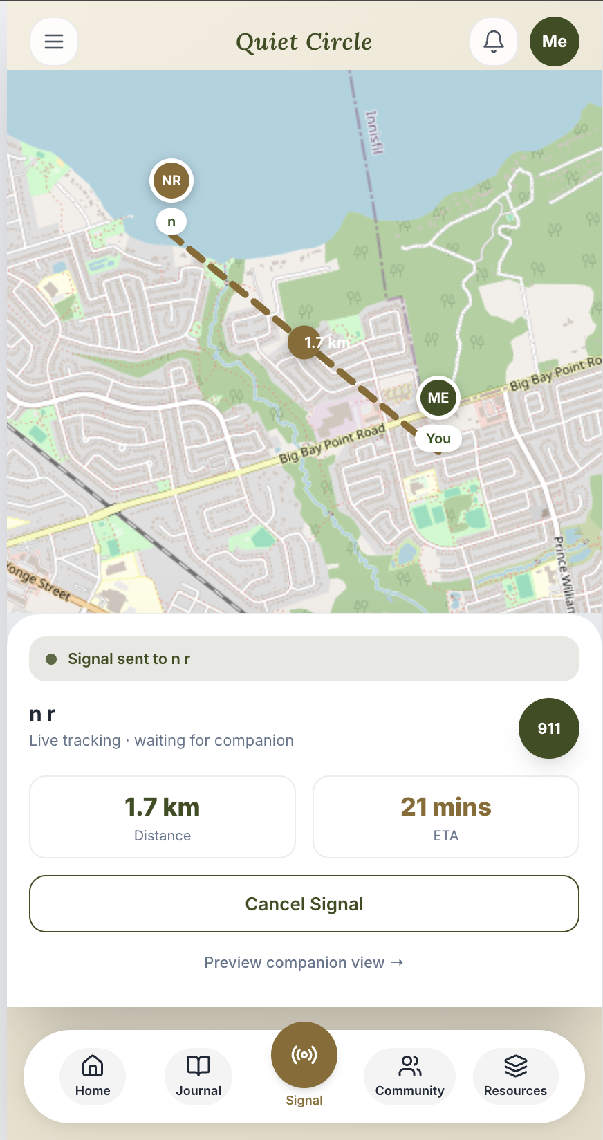
Alerts trusted contacts silently, with no assumption that a family member is on the list. Users choose who gets notified, and a confirmation step avoids accidental sends.
Community
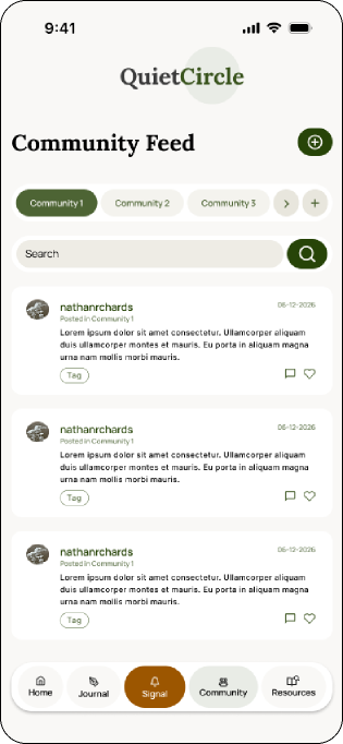
Peer spaces with a public/anonymous posting toggle so users control how visible they are within their own communities.
Resource Hub
Housing, employment, and affirming healthcare, not just mental health content.
Safe Settings
A stealth toggle that lets the interface present as a generic wellness app, the "not visibly queer" requirement raised directly in our survey.
Journal
Private mood tracking, kept separate from anything shared with peers or contacts.
Validated with AI before a single wireframe. Before either of us opened Figma, I used Claude Code to build a working, clickable prototype of the concept above: live Signal tracking, the emergency-contact flow, onboarding, and a home screen built to pass as a generic wellness app. That fast build-and-feel loop is what shaped decisions like keeping the stealth framing prominent, before design even started.
Two Decisions That Mattered Most
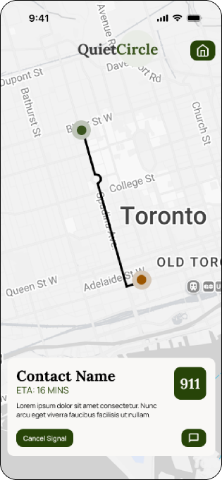
Signal needed a confirmation step
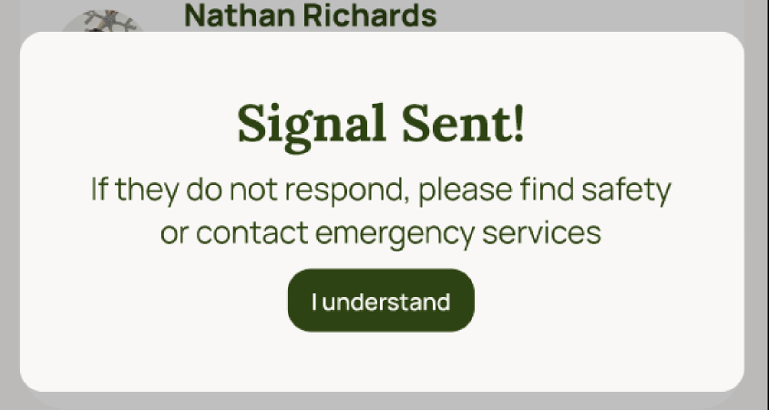
No confirmation step before a signal is sent. Unclear what the contact receives.
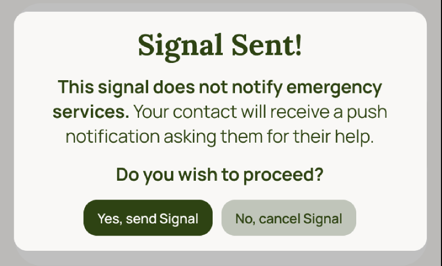
Added context on what happens next, plus a cancel option.
A blank community feed reads as broken
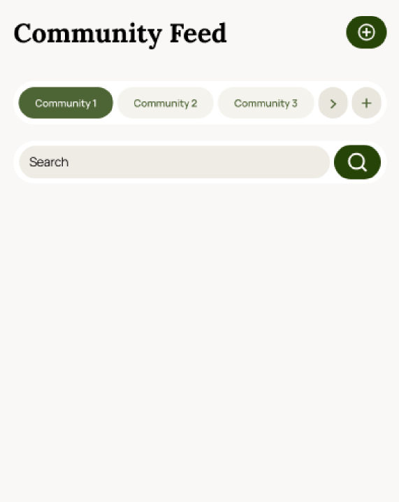
A newly joined community's feed appeared blank with no explanation.
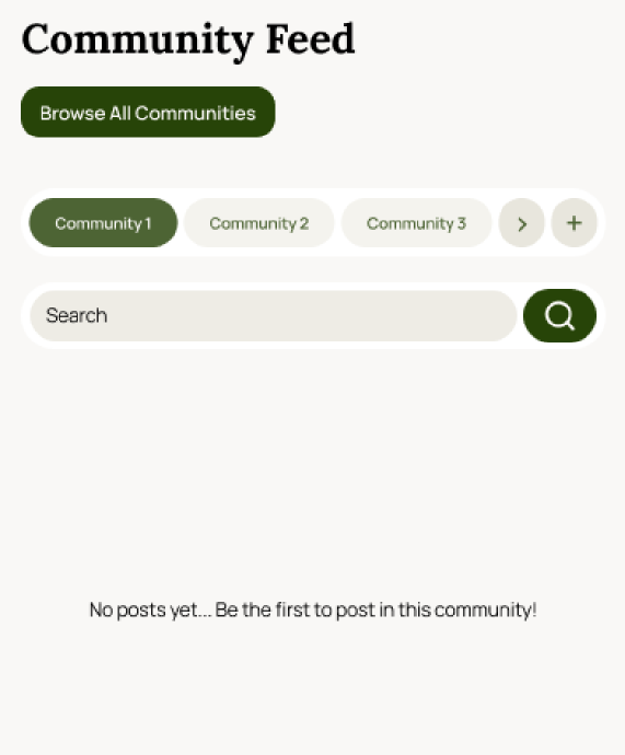
Added context: "No posts yet, be the first to post in this community."
Three smaller fixes came out of the same testing round: clearer language for adding a contact who doesn't have the app installed, a renamed "Browse All Communities" button after the icon-only version got missed entirely, and a placeholder prompt so a blank post box felt less intimidating.
Wireframes to Tested Prototype
Low-fidelity wireframes mapped all five flows first. Real branding, iconography, and copy came in at mid-fidelity. We tested five core tasks on that prototype, tracking time on task, prompts needed, and errors made.
| Task | Time on Task | Prompts | Errors |
|---|---|---|---|
| Send a Signal | ~1 min 7 sec | 1 | 0 |
| Add a Contact | ~37 sec | 0 | 0 |
| Navigate Resources | ~34 sec | 0 | 0 |
| Draft a Post | ~20 sec | 0 | 0 |
| Join a Community | ~30 sec | 0 | 1 |
Design System
A calm, trustworthy palette and type pairing meant to read as a generic wellness brand at a glance.
#274408
#4D6434
#9C5600
#F9F8F6
Title: Lora, Display / Wordmark
Heading 1: Manrope ExtraBold 24px
Body: Manrope Regular, legible and calm for everyday reading.
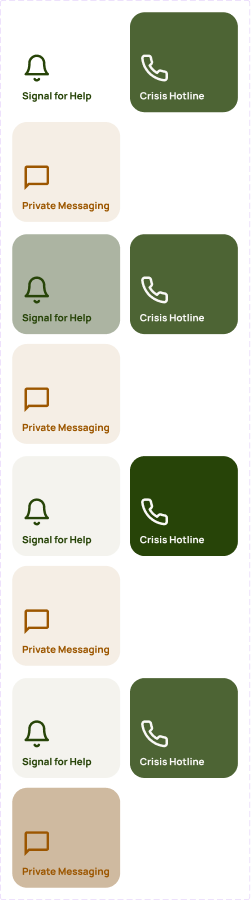
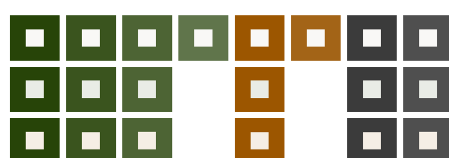
Every pairing in the palette was checked against WCAG AA+ before it reached a screen. This is a sample of that reference sheet.
Where This Stands, and Takeaways
Quiet Circle was built for UXD-5310, a capstone course, not a live client engagement. It hasn't shipped, and it hasn't been tested outside our original 11 survey respondents and 2 interviewees. Next: a WCAG AA accessibility review, testing with 5+ more participants (prioritizing BIPOC, rural, and neurodivergent queer youth), and exploring partnerships with YouthLine and Rainbow Health Ontario for resource curation.
-
Small usability moments carry real weight
None of the iteration rounds required a redesign, just clearer language and context at the right time. For an app dealing with crisis and disclosure, that clarity isn't a nice-to-have.
-
A small sample still surfaces real signal
Eleven respondents is a small base to design from. But the convergence with published literature gave us confidence the patterns we saw, discretion, distrust of family-centric defaults, were real rather than noise.
-
Discretion and disclosure aren't the same problem
Being stealth on a shared screen and being ready to disclose to a peer community are different needs. Quiet Circle has to hold both without one undermining the other.
What This Shows
This project demonstrates:
- Research grounded in a real, underserved population, combining literature review, survey, and interviews
- The ability to translate sensitive, high-stakes findings into concrete design decisions
- Ownership of a full design system, from color and typography through component states
- Honest reporting of research limitations rather than overstating a small sample
- Iterative refinement driven by direct usability testing feedback