The Problem
Pursuit OCR, a play-based fitness facility with a tricycle racing track, was experiencing declining customer retention and profit margins. Competitors were integrating emerging technology to create novel experiences, making Pursuit OCR's offerings feel outdated, and the facility lacked any gamified or challenge-based elements that drive repeat visits.
- Business model depended on constant new-customer acquisition, an unsustainable pattern for a small facility
- No system existed for encouraging social sharing despite an "Instagrammable" venue
- Competitors were pairing team-building with low-cost emerging tech (AR, projection-mapping), a gap Pursuit OCR could close affordably
On this project I owned the admin-side flow across wireframes through hi-fi, the usability testing sessions, and the brand system. Kayden Tran, our other UX designer, owned the player-side flow. Alex led content strategy, and David built the final product from our handoff.
Key Insight
The Solution
A digital race-management system for the tricycle racing track featuring:
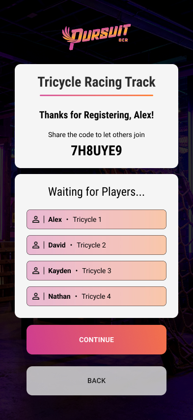
- QR-based mobile registration: players register via their phones instead of a physical kiosk
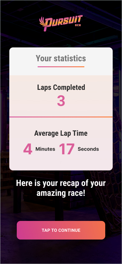
- Leaderboards & real-time tracking: Race Mode (competitive) and Leisure Mode (personal tracking)
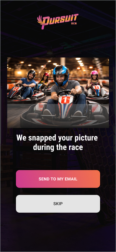
- In-race photography: automatic photo capture sent to players post-race, a shareable moment tied directly to the system
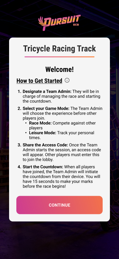
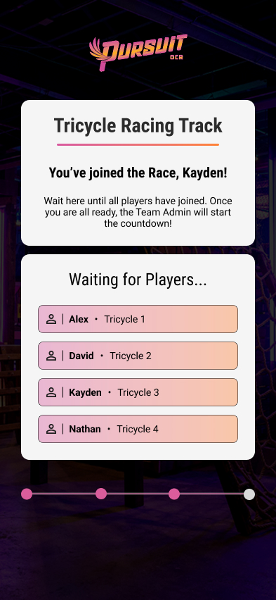
- Two separate user flows: Team Admin (manages race setup) and Player (participates)
Each piece answers a specific part of the problem. The leaderboards and mode system are the gamified elements the facility was missing entirely. In-race photography answers the Key Insight directly, turning the space's existing photogenic quality into a shareable moment instead of relying on players to think to take their own photos. The Admin/Player split kept the system simple enough for staff to actually run it race after race, which mattered for anything meant to drive repeat visits rather than serve as a one-time novelty.
Key Decisions
Kiosk to Mobile
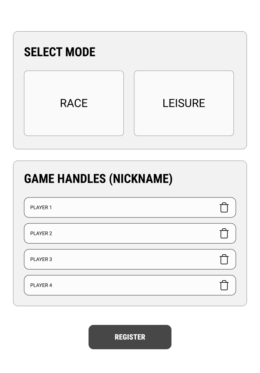
Our first concept was a registration kiosk: a tablet mounted at the track where the team leader registers, assigns bikes and nicknames, and starts the countdown. That required Pursuit OCR to buy a tablet and a custom stand, a hardware cost the business couldn't justify. We pivoted to a mobile-first, QR-code-based flow so players register on their own phones instead, removing that cost from the business's side entirely and splitting the experience into separate Admin and Player flows.
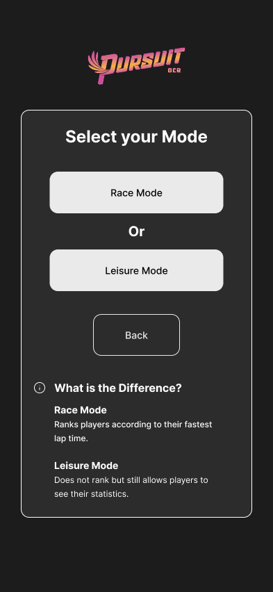
Clarity Fixes from Usability Testing
Implementation, by owner:
Final Screens
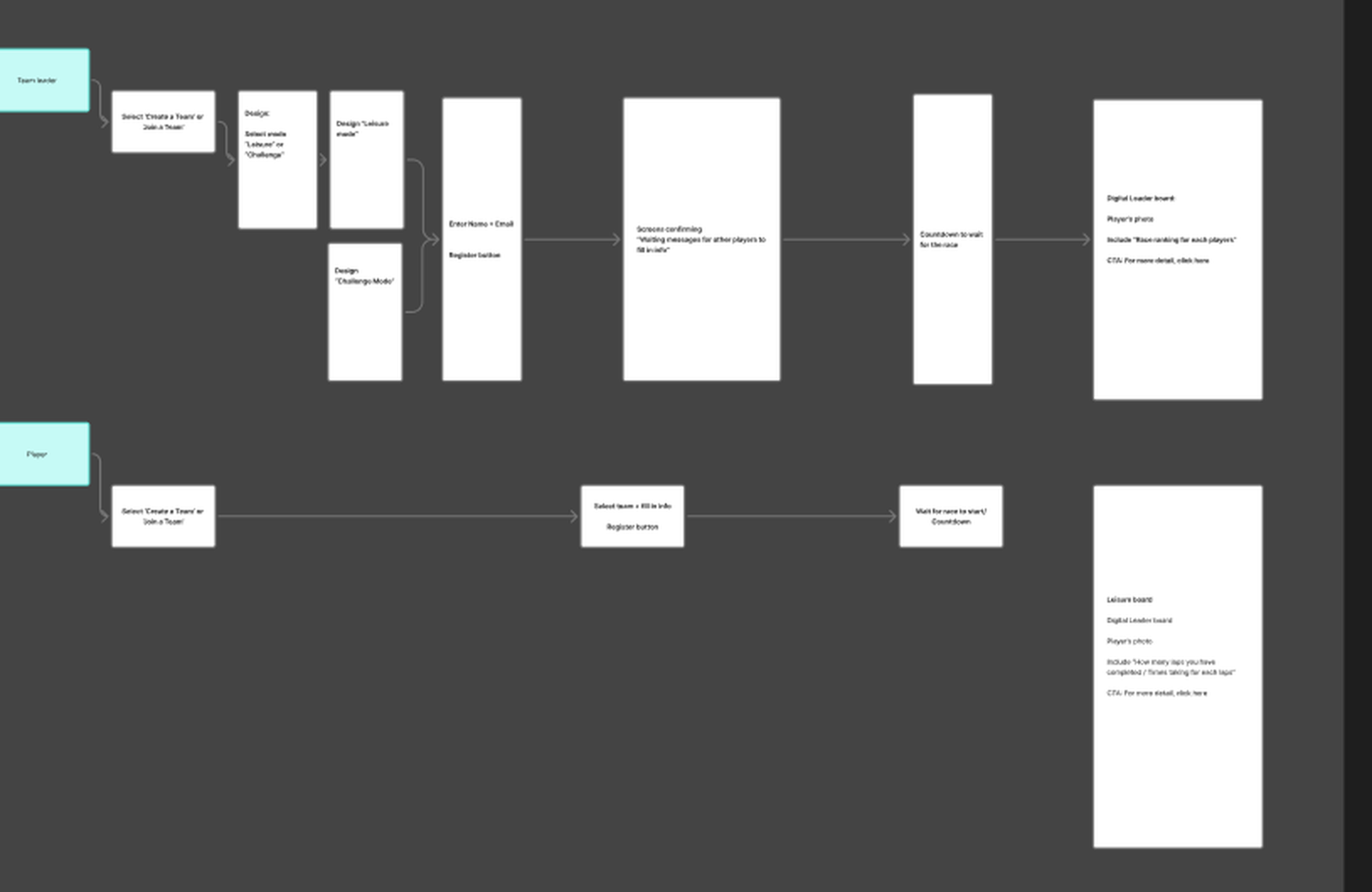
Before wireframing individual screens, we mapped both paths through the system: the Team Leader setting up a race, and the Player joining one.
Getting Started
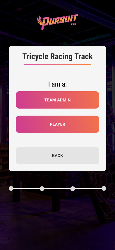
Admin & Player
The Race
Handoff & Design System
We handed off the full Figma file to David, including our user flows, final designs, and a documented design system spec: exact hex values, a type scale down to the pixel, component states, and spacing tokens, not just a moodboard of colors. We then held a walkthrough meeting to confirm he understood the system's architecture before he started building. That spec is reproduced below, not summarized.
Color Palette
#1c1c1c
#2c2c2c
#d85a9f → #ff8234
#ffffff
Typography
Heading 1 - Roboto Condensed Bold 28px
Heading 2 - Roboto Condensed Bold 20px
Heading 2 (Regular) - Roboto Condensed 20px
Heading 3 - Roboto Bold 16px
Body Text - Roboto Regular 14px
4:17
Heading Components
Sample Heading
Buttons & Inputs
Cards
Icons
Spacing & Layout
- Card Border Radius: 12px
- Button Height: 60px
- Input Height: 60px
- Container Padding: 24px
- Section Gap: 36px
- Gradient Underline: 3px height, 60px width
Design Principles
- Pink-to-orange gradient (#d85a9f → #ff8234) as primary brand element
- Diagonal offset cards matching website design
- Gradient underlines on major headings
- Gradient text for statistics and numbers
- Uppercase button text with letter-spacing
- Consistent 12px border radius throughout
- Light card backgrounds with dark text for readability
- Roboto font family for all text
Where This Stands, and Takeaways
We pitched this system, including the cost tradeoff between the kiosk and mobile approaches, to Pursuit OCR's owner as our final recommendation. It has not been implemented yet. If it moves forward, two numbers would tell us whether it actually worked: return-visit rate, the one from the original problem statement, and social engagement rate, whether the in-race photo feature actually converts the space's "Instagrammable" quality into shares and mentions.
-
Test Language Earlier
IA testing before wireframing would have caught the "race mode" terminology confusion and the wait-state visibility gaps before Sprint III, not during it.
-
Physical Integration Isn't Solved by Design Alone
Kayden's map and poster addressed the immediate confusion between the app and the track. What we didn't get to: testing that poster with real players standing in the actual space, rather than just in the prototype.
What This Shows
This project demonstrates:
- A full UX process, start to finish: discovery through high-fidelity design and developer handoff
- Adapting the design when a hardware cost the business couldn't justify forced a pivot from kiosk to mobile
- Site visits, stakeholder interviews, and usability testing, not just time in Figma
- Clear ownership within a team: what I drove personally versus what was shared
- Reporting an honest outcome, pitched but not yet implemented, rather than overstating it